Generate Leads With Great Web Design
Nobody is shocked to hear that all businesses need a good website design to have better results. Websites serve a lot of different functions, from allowing users to discover brands and what they offer, to helping them access products they want, learn things they’re curious about, and more. But is website design connected to lead generation? How can great web design support your efforts to generate leads? Here are 5 ways this can happen:
1.) Good Design Equals Good User Experience
Consumers have certain expectations when it comes to the websites they visit, all of which tie into the . If someone doesn’t have a good experience on your website, they will not take the action you want.
And there are loads of user experience elements directly targeted through web design:
- Page load speed
- Website navigation
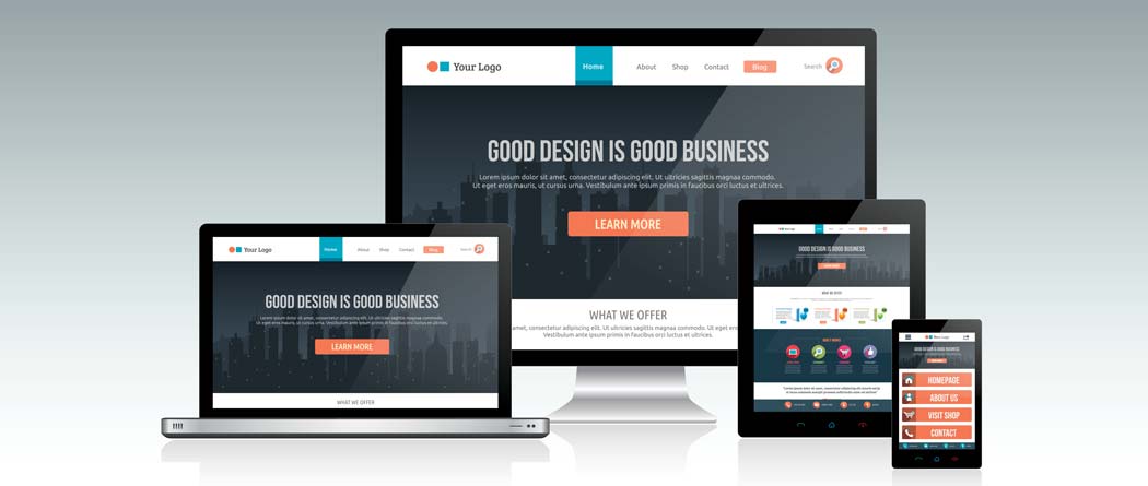
- Mobile-friendliness
- Website responsiveness
2.) The Aesthetics
Never judge a book by its cover, sure, but imagine going on a site today with a red font on a neon green background. How fast do you think you’d click the X to close the page?
The right website design should support your goals of acquiring leads, be something pleasant to look at, and actually help the user easily go through the funnel until they convert.
The way your website looks directly ties into a lot of the first impressions people will have of your business.
3.) Integrated “Proof” of Quality
Users might not be convinced to convert solely on what you have to say about your business – they need some outside views as well. The problem is, if you wait for them to open a new tab and do their research, you’re increasing the odds of losing that user.
Adding customer reviews in key places on your site can greatly improve the number of leads you get. The secret lies in also knowing where these reviews work best, which is what good web designers always know.
“The right website design should support your goals of acquiring leads and help the user easily go through the funnel until they convert.”
4.) CTA Visibility
Users should never wonder where the CTA button is. It should be one of the most visible parts of your site, clearly express the next step the user will take (such as Sign Up, Download, Buy, etc.), but not stick out too much to seem out of place.
It’s a balance designers often have to test a few times until they find the right approach.
5.) Keep Them Engaged
The design should support the user journey until they convert. The longer the funnel, the more possibilities of losing them.
It’s why using visuals in strategic places is essential for website design, to make sure the consumer’s attention is always on the site.
Generate Leads with Great Web Design by Hungerford Media
Hungerford Media can help you create stunning websites that support your brand’s goals — from lead generation to selling more products and increasing your revenue. Contact us here or call us at (616) 259-0078 to boost your small business’s marketing efforts.


